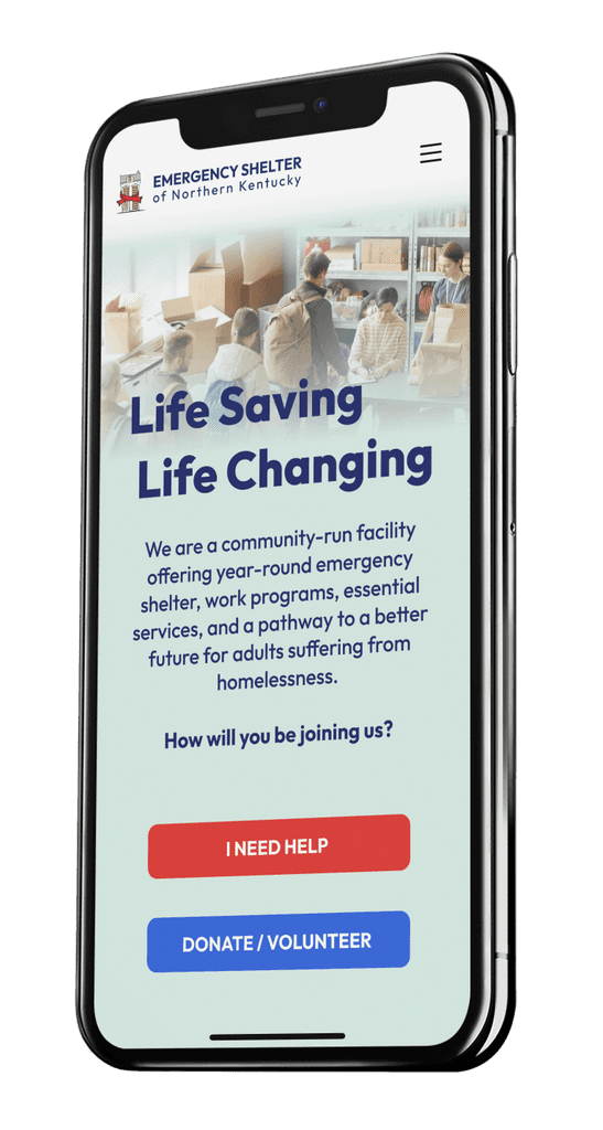
Increasing Community Awareness for the Emergency Shelter of Northern Kentucky
Project Overview
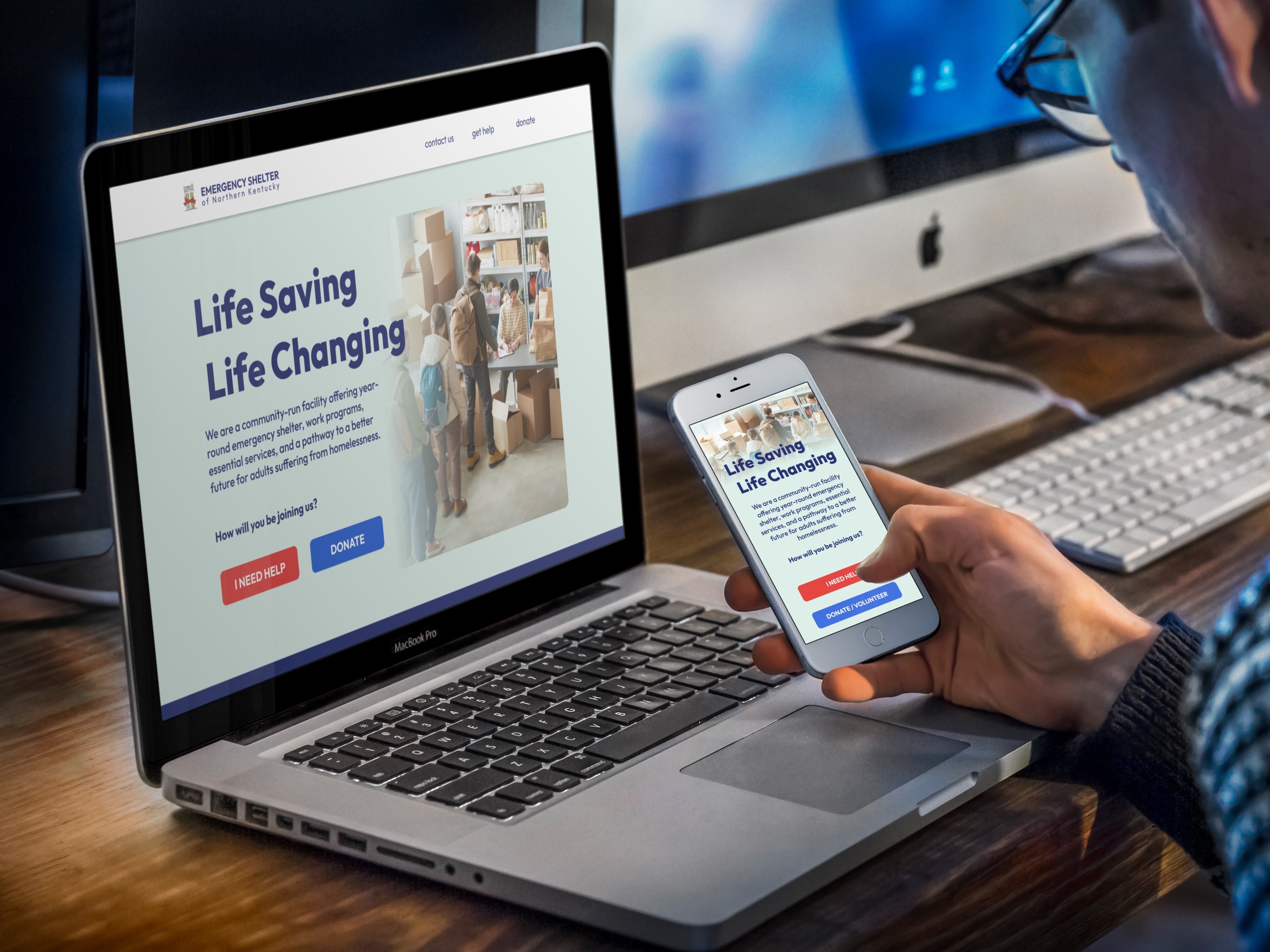
The Emergency Shelter of Northern Kentucky (ESNKY) provides year-round emergency shelter, work programs, and essential services for adults experiencing homelessness. I partnered closely with ESNKY to redesign and redevelop their website, creating a fully functional platform with new features to better support their mission and community.
The previous website faced significant challenges in usability, accessibility, and navigation. Issues included non-compliance with WCAG guidelines, a poorly functioning navigation menu, and a lack of clear calls to action, which limited user engagement and support. This comprehensive redesign was undertaken as a contribution to ESNKY’s mission, transforming their digital presence into an accessible, user-friendly resource that better serves their audience and aligns with their goals.
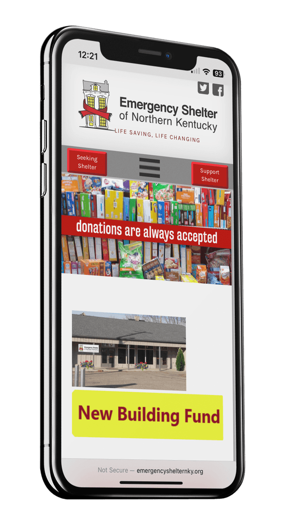
• Showcasing the previous homepage we see issues in the mobile version of the site's responsiveness. The banner below the menu bar doesn't properly fit and is cut off on the left and right sides.
• The hamburger menu had been user tested as difficult to find due to its untraditional placement in the center of the gray menu bar below the large logo at the top.
• Recent news postings had no labels and rarely were updated.
• The facebook feed was no longer functional.
• The Twitter feed was also no longer functional.
• The footer contained some navigation links, some worked others were non-functional.
Beginning the Redesign Process
My Roles: Researcher, User Tester, UX/UI Designer, Web Developer
My Tools: Pen & Paper, Figma, Framer, Photoshop, MailChimp
Duration: 10-months
Process: Research, Competitive Audits, Information Architecture, Ideation, Wireframes, Usability Testing, Prototype, Visual Design.
Research Insights
Target Audience:
Comprehensive user research identified two primary audience segments:
Individuals in Need: Those seeking shelter and employment opportunities, requiring quick access to essential services and resources.
Supporters and Donors: Compassionate individuals, often older demographics, motivated to volunteer or donate to support the shelter’s mission.
These insights shaped the website’s architecture and content, ensuring streamlined navigation for individuals seeking assistance and clear pathways for supporters to engage and contribute.

Competitive Audit:
A systematic evaluation of other shelter websites revealed key design and functionality best practices. These included:
Clear calls to action for donations and volunteering.
Intuitive navigation for accessing resources.
Accessible and inclusive designs that comply with WCAG standards.
Incorporating these findings enabled the creation of a user-centric, mission-aligned digital platform optimized for engagement and usability.
Information Architecture
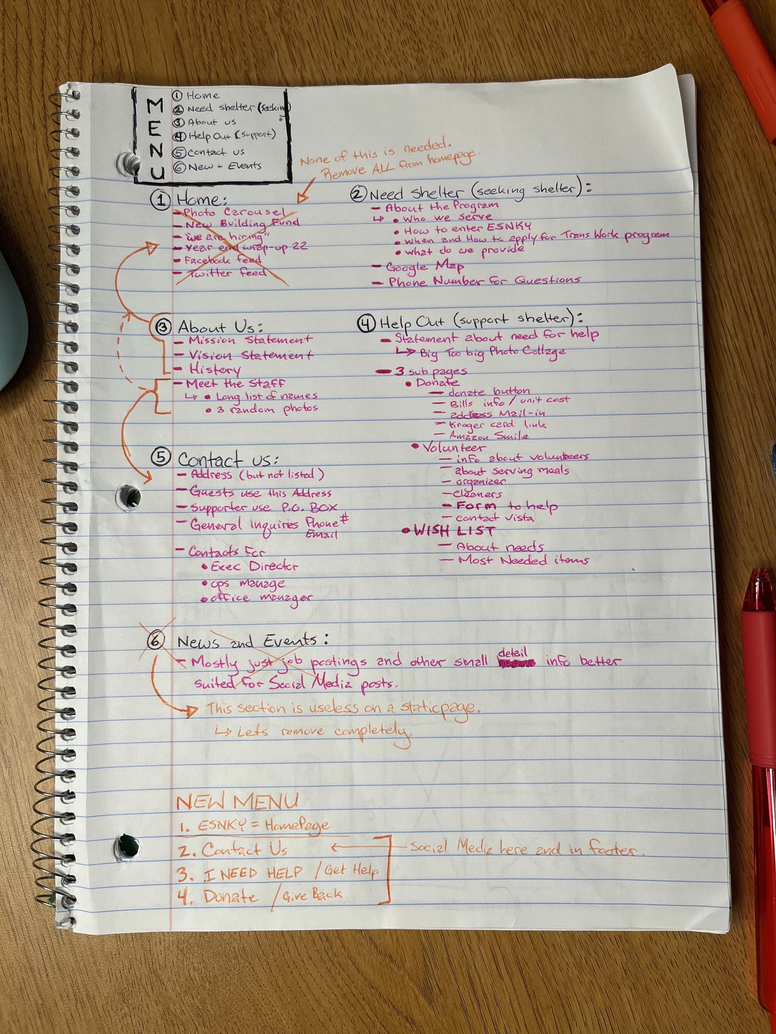
Meticulously, I recorded the site's provided content to facilitate an intuitive mapping of all the website's data. This deliberate organization of information aims to enhance user navigation and streamline access to critical information. All while aligning with the shelter's core objectives.
Original Site Map:
• Home Page
Need Shelter?
About US
Help Out
Contact Us
News & Events
After all I.A. is collected the process of eliminating redundancies and prioritizing what's left can begin.
Refined Site Menu:
• Home Page (About Us)
Get Help
Donate / Volunteer
Contact Us
Wireframes: Rough Sketching Layout Ideas
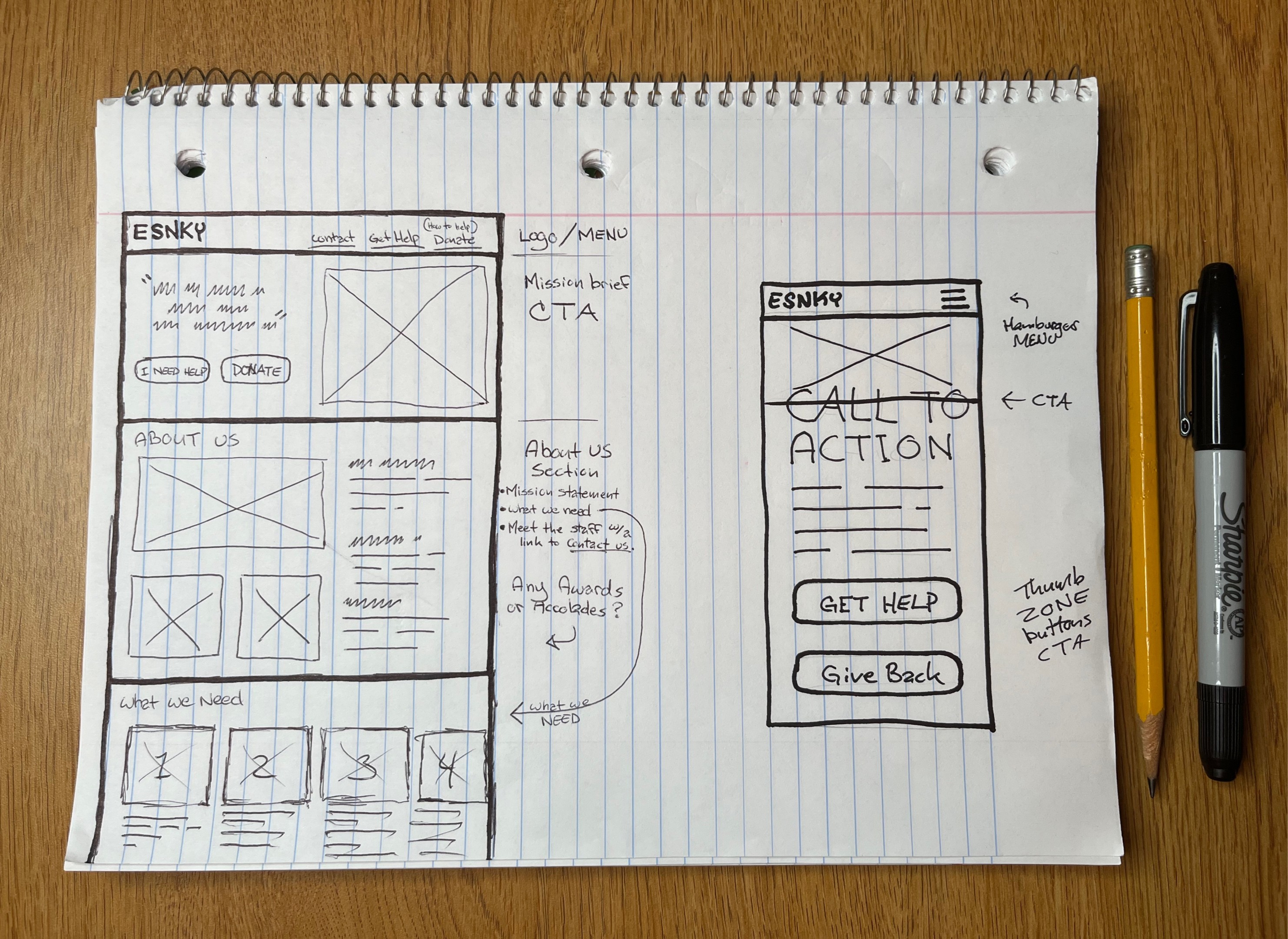
Digital is great, but we are analog beings in an analog world. I'm a much bigger fan of the freedom I have with pencil and paper than what any digital platform can provide. Below you will see my earliest conceptualized ideas based on the information gather through the above empathize and research stages.
Wireframes: Homepage
Opening with a Call-To-Action, while focusing on two buttons to guide user's into the two most common needs of ESNKY's website visitors. This is followed by a 'Who are we' section as most non-profit's site contain this info front and center.
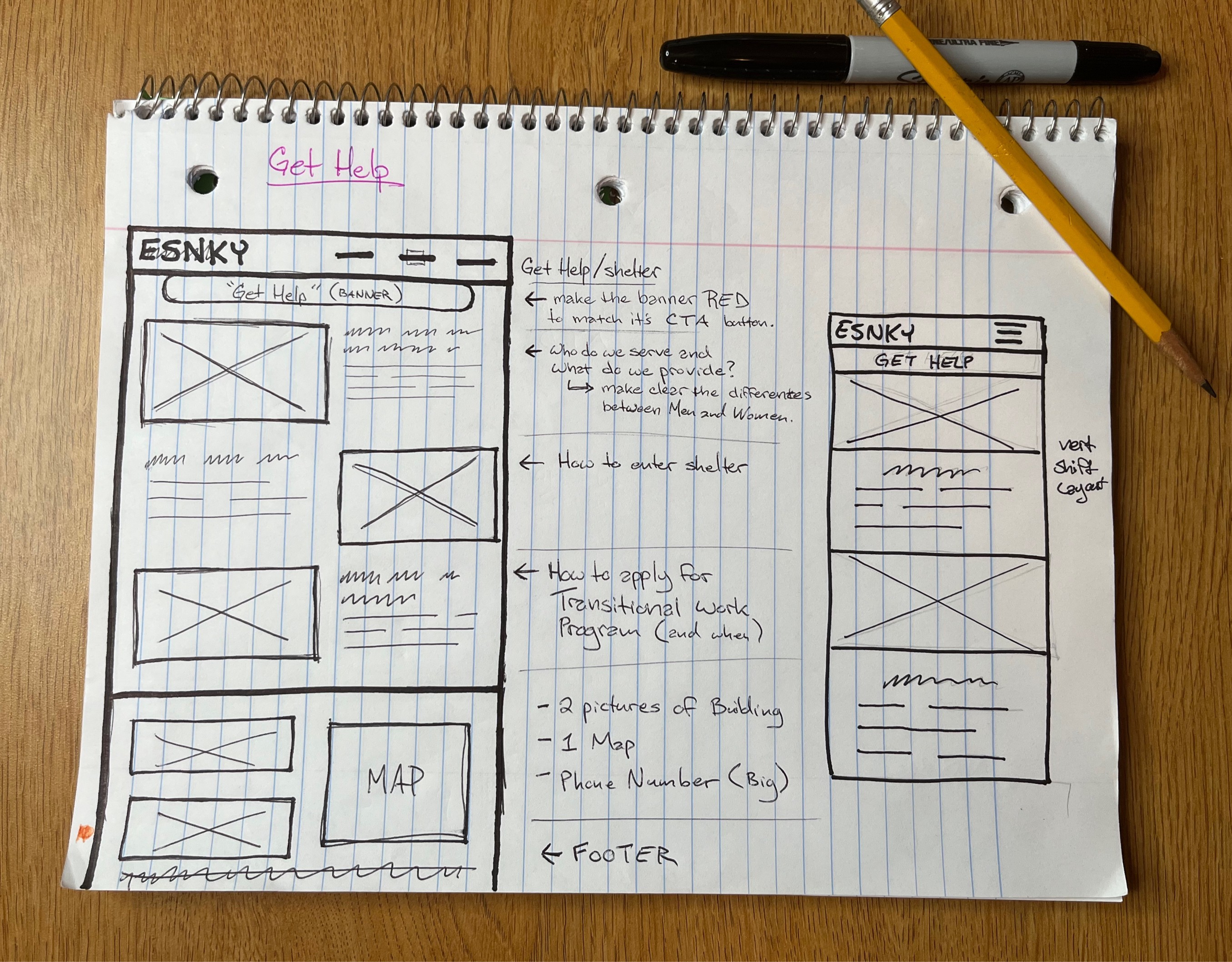
Wireframes: Get Help Page
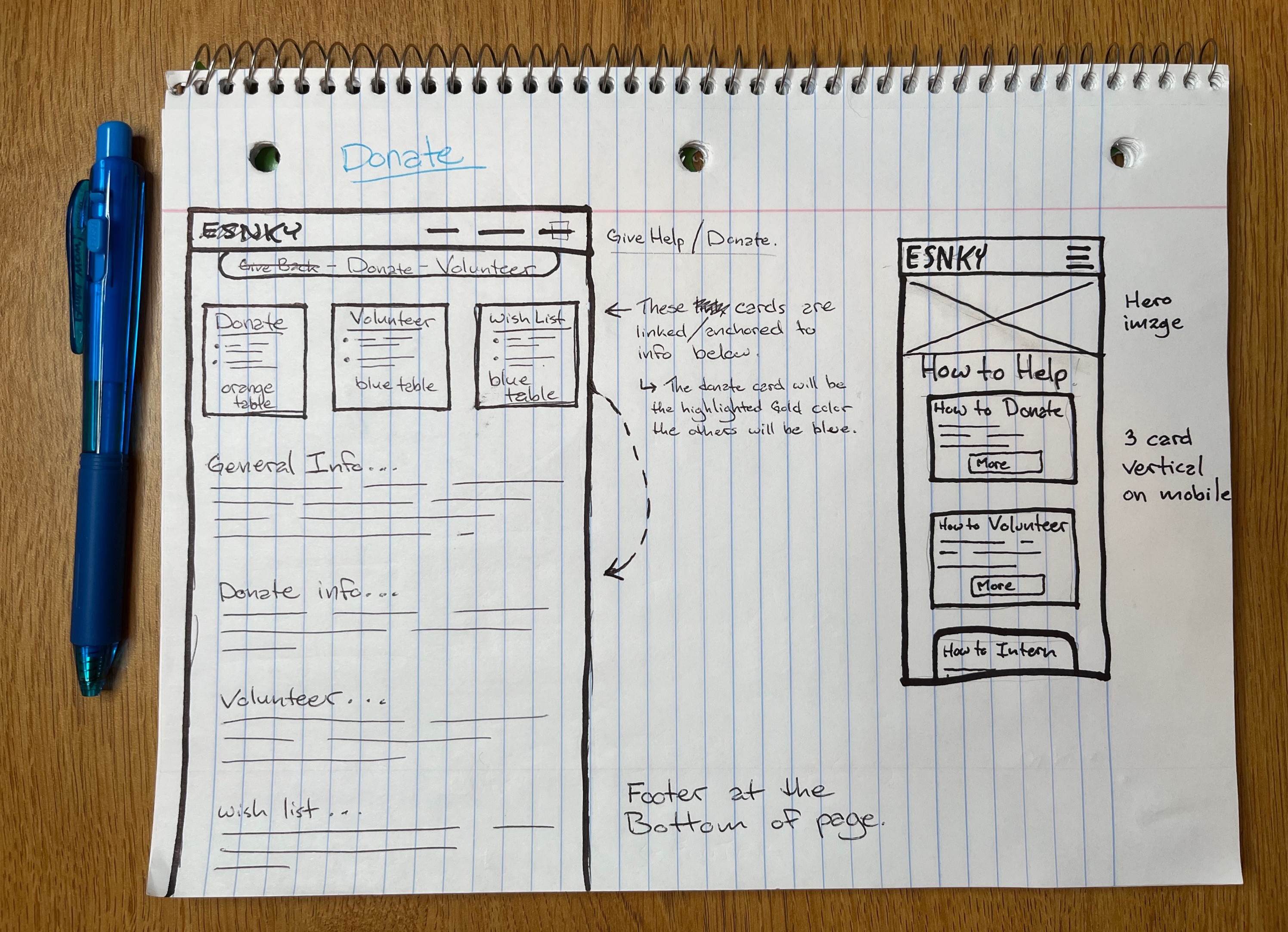
Wireframes: How to Donate
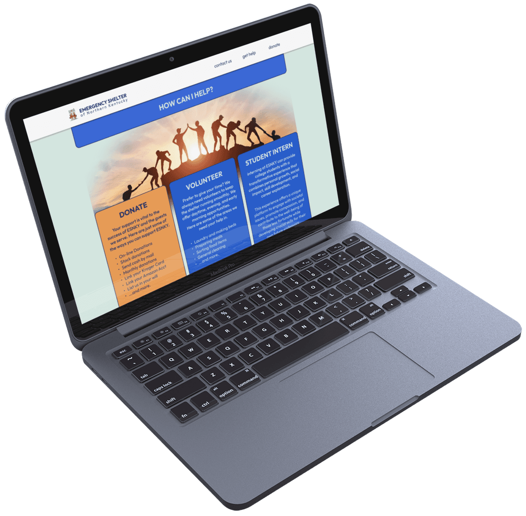
The current page lists 3 tabs in the donation and volunteering section of the site. These three tabs will now exist simultaneously in separate boxes to show their differences, but all on the same page to better accomplish the mission of this section.
Building the Prototype
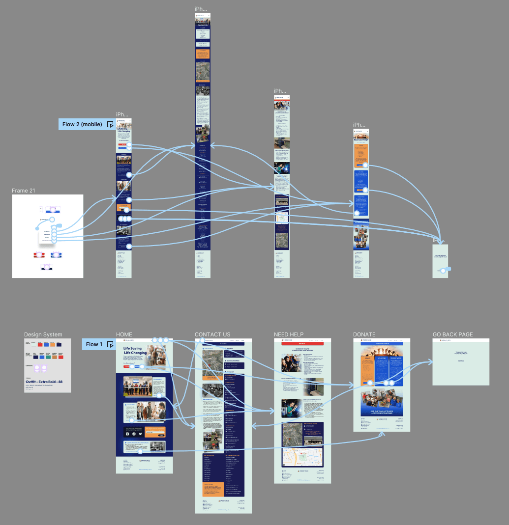
The interactive prototype showcases the complete user journey across the redesigned website. Using Figma, I created a connected visual map of all screens and pages to illustrate seamless navigation and functionality. This prototype highlights the improved user flow, ensuring easy access to essential resources for individuals in need and clear engagement pathways for supporters.
Usability Testing
This usability study involves observing and gathering feedback from users as they interact with the new design to assess its user-friendliness and identify areas for improvement.
Users where given a small list of basic tasks to complete upon visiting and testing the updated redesign of the website. Much like the user tests performed on the current version of the site, this information will guide the outcome of the final product.
After these tasks were completed, users were given extra time to browse and feel things out to be able to give feedback with a better grasp over the entire experience of the newly redesigned prototype.
The results directly contributed to the outcome of the final visual designs seen in the following section.
Final Prototype: Before and After
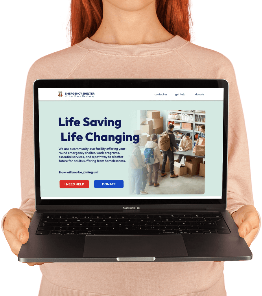
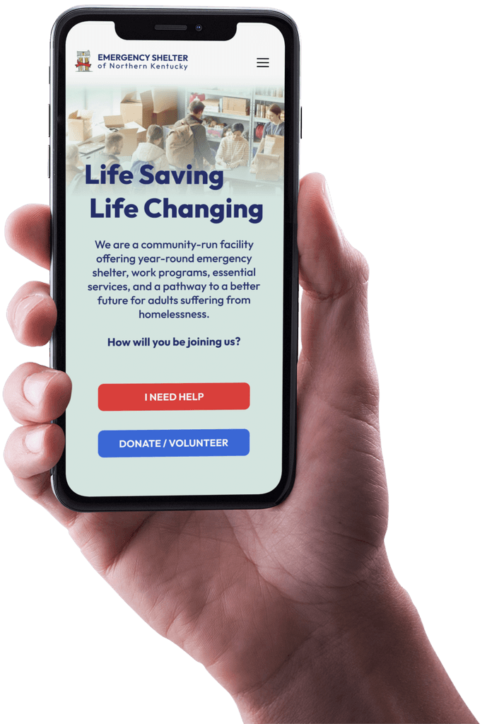
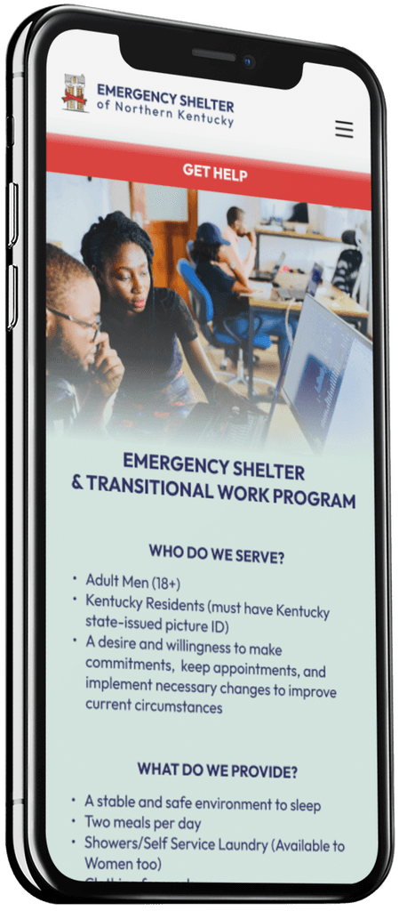
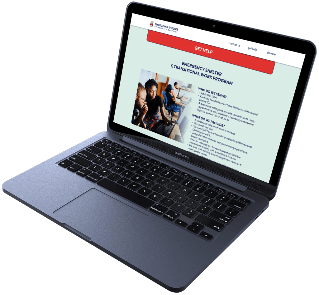
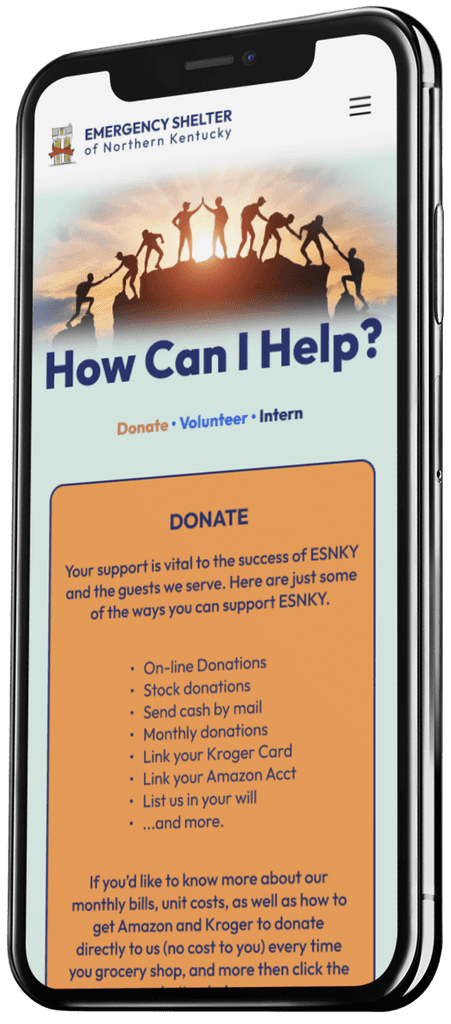
Using ESNKY’s branding guidelines, I created a refined mobile prototype showcasing the transformation from the outdated design to a user-focused, visually cohesive interface. This marks the conclusion of the prototyping stage, setting the foundation for a nine-month development phase involving extensive collaboration with the organization to bring the final product to life.
A more intuitive Menu location, smaller logo designed for mobile devices, as well as the two main call-to-action buttons being placed in what I refer to as the Thumb Zone have all been considered and implemented with purpose.
From Prototype to Reality
Let's chat about your next project.
+1 (859) 816-8488
brandon.migliorisi@gmail.com
©2025 Brandon Migliorisi. All rights reserved.
